1. Custom gifts need more than a name on top
A personalised gift should feel like it was made for a specific person, not just printed with a text label added at the end. That means thinking about the occasion, the relationship, the display space, and the tone of the gift. A graduation piece might need to feel celebratory and clean. A wedding gift might need to feel elegant and balanced. A birthday piece might be more playful or character-led.
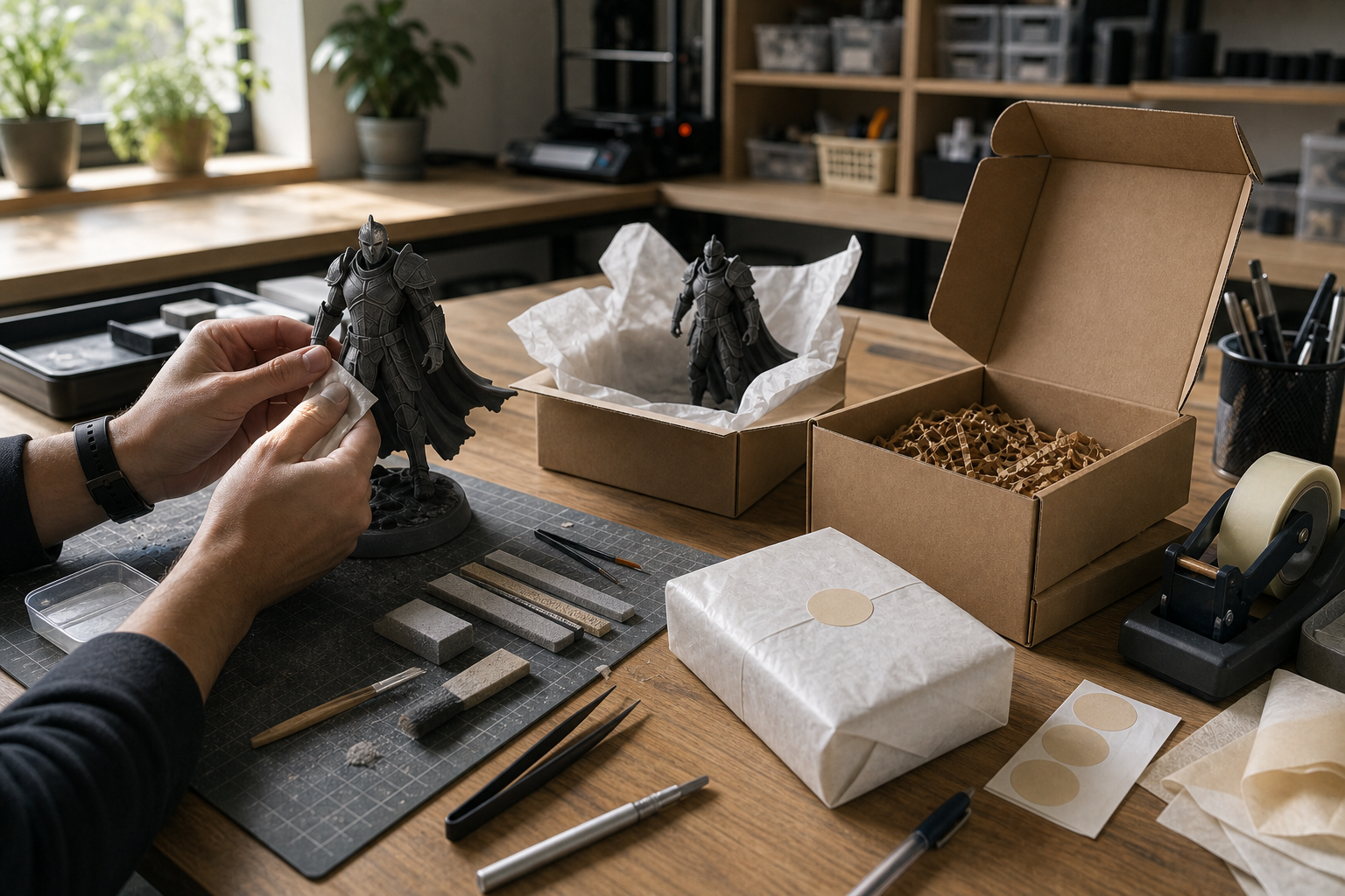
We like to build gifts around the story behind them. That could mean a date, initials, a small quote, a symbol, or a shape that reflects the person receiving it. The most memorable pieces usually have one clear idea and do that idea well. When a custom gift is overcomplicated, it starts to lose the emotion that made it interesting in the first place.
2. Graduation gifts should feel earned
Graduation gifts work best when they feel like a marker of achievement, not just a generic object with a certificate theme. We can design pieces around the school name, graduation year, degree, name, or a symbolic shape that reflects the field of study. A clean 3D printed plaque or display object can hold those details in a way that feels more lasting than a flat card.
These pieces are often kept on a desk, shelf, or study area, so the proportions matter. The design needs to be compact enough to display easily, but bold enough that the text remains readable. If the item is likely to be photographed or given at an event, we also think about how it looks from a distance and under different lighting.
3. Wedding gifts should be personal without becoming cluttered
Wedding gifts are usually strongest when the design stays calm and intentional. Names, dates, initials, and a shared symbol can be enough when they are arranged well. The trick is to create something that feels special without pushing too many elements onto one object. A good wedding piece should feel balanced in the hand and easy to place in a home afterwards.
Material choice matters here too. A clean PLA piece may be the right answer for a display object. If the design needs a finer surface or a more refined visual result, resin can be useful. The goal is not to make the most dramatic object. It is to make a piece that feels thoughtful when it is opened and still looks right months later.
4. QR code signs need functional design first
QR code signs for cafes, counters, and reception desks are a great example of where utility and design meet. The sign has to look good, but it also has to scan correctly in the real world. That means we pay attention to contrast, size, spacing, and the clean framing around the code. If the design is too decorative, the code can become unreliable. If it is too plain, it may not fit the brand.
We can tailor these signs to match the space they live in. A cafe counter sign may need brand colours and a simple call to action. A membership desk sign may need a clear instruction like “scan here”. A table sign may need to fit on a small base without tipping over. The best QR signs are the ones people barely have to think about because they work immediately.
5. Door signs should be readable first and decorative second
Door signs are often the opposite of a display gift. Their main job is clarity. The text needs to be readable from the right distance, the mount needs to suit the surface, and the finish should match the room or business it belongs to. That applies to office doors, studio doors, toilet signs, room labels, and small brand plaques.
We design door signs so they look deliberate in place rather than like an afterthought fixed to the wall. That can mean simple typography, a raised border, a logo, or a small icon to help the message read quickly. For a business, that kind of sign is part of the customer experience. For a home, it can make a space feel more organised and personal.
6. The design process is what makes the piece feel premium
Custom work succeeds when the design process is careful. We usually start with the use case, gather any names, dates, logos, or references, and then decide how much detail the material can support. After that comes modelling, scale checking, and a review of how the object will actually be printed and finished. That process sounds simple, but it is what separates a meaningful custom piece from a generic print.
A premium feel comes from proportion, surface quality, and restraint. It also comes from knowing when to leave space. If a gift or sign is crowded, the message gets lost. If it is too plain, it feels unfinished. The useful middle ground is where the work becomes memorable.
7. Common mistakes to avoid
The most common mistake in custom gift and signage work is trying to do too much. People often want every idea included in one object. In practice, a few strong details are usually better than a crowded layout. Another mistake is ignoring the practical side of the brief. A beautiful sign that cannot be read, or a gift that cannot be displayed well, is not finished properly.
The other mistake is treating the project like a template. Even if we reuse a style or format, the final piece should still respond to the person, space, or event it is for. That is where tailor-made design earns its value.
What 4leafx can make
Graduation gifts
Names, dates, school colours, and display pieces for desks, shelves, and celebrations.
Wedding gifts
Personalised pieces with initials, dates, and a cleaner premium finish.
QR code signs
Cafe and counter signs that are built for real-world scanning and daily use.
Door signs
Readable, durable signs for homes, studios, offices, and customer-facing spaces.
Conclusion
Custom 3D printed gifts and signage work because they are useful and personal at the same time. They can mark a milestone, make a space clearer, or give a business a cleaner first impression. At 4leafx, we treat these pieces like proper design work, not just decoration with text attached. The result should feel rare, meaningful, and built for the person or place it was meant for.